Rows: 25
Columns: 11
$ Comunist          <fct> Yes, No, No, Yes, Yes, No, Yes, No, No, No, Yes, No,…
$ Region            <fct> South, Center, Center, South, Center, North, Center,…
$ Red_Meat          <dbl> 10.1, 8.9, 13.5, 7.8, 9.7, 10.6, 8.4, 9.5, 18.0, 10.…
$ White_Meat        <dbl> 1.4, 14.0, 9.3, 6.0, 11.4, 10.8, 11.6, 4.9, 9.9, 3.0…
$ Eggs              <dbl> 0.5, 4.3, 4.1, 1.6, 2.8, 3.7, 3.7, 2.7, 3.3, 2.8, 2.…
$ Milk              <dbl> 8.9, 19.9, 17.5, 8.3, 12.5, 25.0, 11.1, 33.7, 19.5, …
$ Fish              <dbl> 0.2, 2.1, 4.5, 1.2, 2.0, 9.9, 5.4, 5.8, 5.7, 5.9, 0.…
$ Cereal            <dbl> 42.3, 28.0, 26.6, 56.7, 34.3, 21.9, 24.6, 26.3, 28.1…
$ Starch            <dbl> 0.6, 3.6, 5.7, 1.1, 5.0, 4.8, 6.5, 5.1, 4.8, 2.2, 4.…
$ Nuts              <dbl> 5.5, 1.3, 2.1, 3.7, 1.1, 0.7, 0.8, 1.0, 2.4, 7.8, 5.…
$ Fruits_Vegetables <dbl> 1.7, 4.3, 4.0, 4.2, 4.0, 2.4, 3.6, 1.4, 6.5, 6.5, 4.…7 Dimensionality Reduction
Introduction
In the realm of statistics and data science, the ability to effectively analyze and draw insights from data is paramount. As we venture into the era of big data, we encounter datasets of increasing complexity and size. These datasets often comprise a vast number of variables, a situation described as high dimensionality. Understanding the concept of dimensionality reduction is essential, not just as an abstract mathematical idea but as a practical tool for making sense of complex data.
Dimensionality reduction sits at the heart of predictive analytics, serving as a bridge between raw data and actionable insights. It addresses several critical challenges in data analysis, including the curse of dimensionality, noise in the dataset, and the difficulties involved in visualizing multidimensional data. By simplifying the data without significant loss of information, dimensionality reduction techniques enable us to build models that are not only more efficient but also more interpretable.
The study of dimensionality reduction offers a glimpse into the interdisciplinary nature of data science, where statistics, computer science, and domain expertise converge. This area highlights the importance of understanding both the theoretical foundations and the practical applications of statistical methods. While the mathematical underpinnings, such as linear algebra, are crucial, the focus here is on grasping the conceptual framework and the impact of dimensionality reduction on data analysis.
The introduction to dimensionality reduction begins with the rationale behind it. As datasets grow in size and complexity, the limitations of traditional analytical tools become apparent. The curse of dimensionality, a phenomenon where the data space expands so much that our data becomes sparse, affects not only the computational feasibility of models but also their performance. Reducing the number of input variables helps mitigate these issues, making models simpler, faster, and more generalizable.
Moreover, in a practical setting, the reduction of dimensionality can be pivotal for noise reduction and visualization. By filtering out irrelevant or redundant features, we improve the model’s accuracy and reliability. Similarly, the transformation of high-dimensional data into a more manageable form allows for effective visualization, which is indispensable for data exploration and hypothesis generation.
Dimensionality reduction techniques, categorized into feature selection and feature extraction, offer a toolkit for addressing these challenges. Feature selection methods focus on identifying the most relevant features for the models. On the other hand, feature extraction techniques like Principal Component Analysis (PCA), transform the original features into a new set of variables that better capture the underlying structure of the data.
Reasons for Dimensionality Reduction
-
Curse of Dimensionality: The curse of dimensionality refers to various phenomena that arise when analyzing and organizing data in high-dimensional spaces (often with hundreds or thousands of dimensions) that do not occur in low-dimensional settings such as the three-dimensional physical space of everyday experience. It’s essential in understanding how dimensionality affects data analysis, leading to specific issues like data sparsity and increased computational complexity.
Understanding the Curse of Dimensionality
When the dimensionality increases, the volume of the space increases so rapidly that the available data become sparse. This sparsity is problematic for any method that requires statistical significance. In order to obtain a statistically reliable result, the amount of data needed to support the result often grows exponentially with the dimensionality. Additionally, high-dimensional datasets are often accompanied by increased computational complexity and a greater chance of overfitting, making models less generalizable to new data.
Example using the
ProteindatasetThe
Proteindataset in theMultBiplotRlibrary consists of data on protein consumption in various countries.- Loading and Exploring the Data
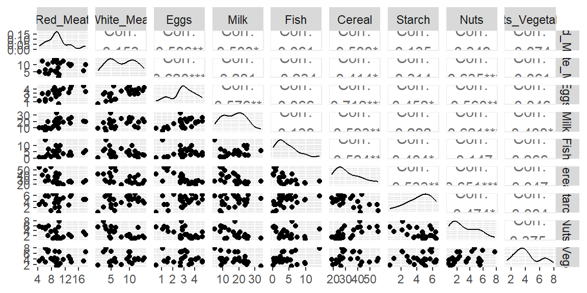
- Below is a scatterplot matrix of the pairs of the quantitative features.
With so many variables, it becomes cumbersome to visualize the relationships between the variables. The above scatterplot matrix shows the scatterplots of the 36 pairs of variables when you have nine features. It becomes difficult to examine all of these scatterplots. These plots also do not show any relationships between three variables at a time, and so forth.
- In addition to visualization, the curse of dimenstionality also implies the sparseness of the data when we have more variables.
Let’s first examine the variable
Milk. Below is a dotplot for this variable.Protein |> ggplot(aes(x = Milk, y = 0))+ geom_point()+ ylab("")+ theme( axis.ticks.y=element_blank(), axis.text.y=element_blank() )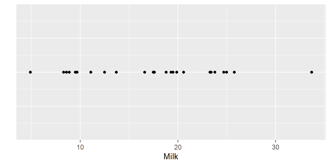
Note that the min value of
Milkis 4.9 and the max value is 33.7. There are 25 observations so we can think of the data for this variable as 25 pieces of information in that variable’s dimension (the \(x\) dimenstion on the plot above). Let’s calculate the ratio of information to the dimensional space:\[ \frac{25}{33.7-4.9} = 0.8681 \]
Let’s now examine another variable along with
Milk. Below is the scatterplot ofEggsandMilkProtein |> ggplot(aes(x = Milk, y = Eggs))+ geom_point()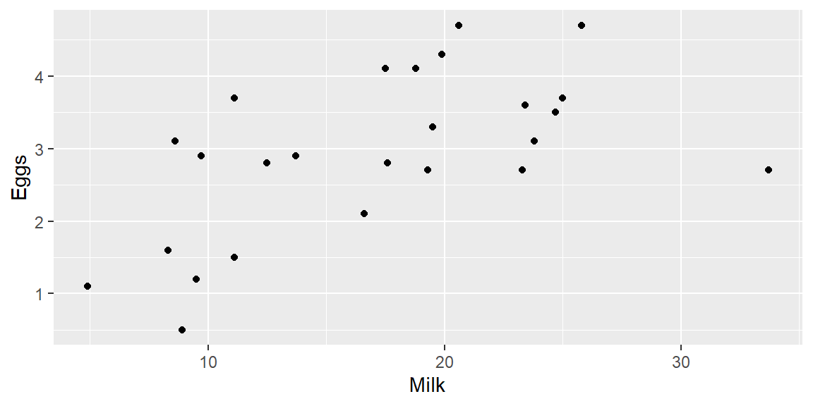
For
Eggs, the range of values are min = 0.5 and max = 4.7. The total dimensional space that these two variables take is \[\begin{align*} \text{dimensional space for Milk}\times\text{dimensional space for Eggs} &= 28.8 \times 4.2\\ &= 120.96 \end{align*}\]We still only have 25 observations. The 25 pieces of information that we have in this two-dimensional space gives us the ratio \[ \frac{25}{120.96} = 0.2067 \]
So in two-dimensional space, the amount of data we have is a much lower ratio of the space than when we had in only one dimension.
Let’s now add in a third variable
Fish. Note that the dimensional space forFishis min = 0.2 and max = 14.2. The size of the total dimensional space is \[\begin{align*} \text{dim. space for Milk}\times\text{dim. space for Eggs}\times\text{dim. space for Fish} &= 28.8 \times 4.2 \times 14\\ &= 1693.44 \end{align*}\]Again, we still only have 25 observations. So our 25 pieces of information only take up a ratio of \[ \frac{25}{1693.44}=0.0148 \] of the 3-dimensional space. The more variables we have, the higher the dimensional space our observations are in. The ratio of our observations to the area of the dimensional space will continue to decrease. Thus, the amount of data available in that high dimension is sparse. This is the curse of dimensionality.
Techniques of Dimensionality Reduction
There are several techniques for reducing the dimensionality of data, broadly categorized into Feature Selection and Feature Extraction.
Feature Selection
Feature selection involves selecting a subset of the most relevant features for use in model construction. There are three main types of feature selection methods:
-
Filter Methods: Filter Methods are among the first steps you can take in preprocessing your data for machine learning models. They are computationally less expensive than Wrapper and Embedded Methods because they do not involve training models as part of the feature selection process. Instead, they rely on general characteristics of the data, such as correlation coefficients, Chi-square tests, and mutual information.
Advantages:
- Speed: They are fast and scalable to high-dimensional datasets because they evaluate features in isolation from the model.
- Simplicity: These methods are straightforward to understand and implement.
- Model Agnostic: They can be applied regardless of the choice of machine learning algorithm.
Disadvantages:
Less Accurate: They might not capture feature interactions well because they evaluate each feature independently.
No Model Context: They do not consider how features will interact when combined in a model, potentially overlooking combinations that would improve model performance.
Common Techniques in Filter Methods
Correlation Coefficient: This measures the linear relationship between two variables. Features with very low correlation to the target variable can be removed.
Chi-Square Test: This statistical test is used to determine if there is a significant association between two categorical variables. It can be used to select relevant features for classification problems.
Mutual Information: This measures the amount of information one can obtain from one variable through another. A higher value means more information shared, making it useful for feature selection.
Variance Threshold: This method removes all features whose variance doesn’t meet some threshold. Since variables with a low variance are less likely to affect the target variable, they can be considered for removal.
Application of Filter Methods
Filter Methods are widely used at the beginning stages of the feature selection process, especially when dealing with very high-dimensional data. They help in narrowing down the feature set to a more manageable size, which can then be further refined using more sophisticated techniques like Wrapper and Embedded Methods.
Example: Protein data
Suppose
Milkis the response variable. We can examine the correlation betweenMilkand all other features.correlation_matrix <- Protein |> select(where(is.numeric)) |> cor() milk_correlations <- correlation_matrix['Milk', ] print(milk_correlations)Red_Meat White_Meat Eggs Milk 0.5029311 0.2814839 0.5755331 1.0000000 Fish Cereal Starch Nuts 0.1378837 -0.5927366 0.2224112 -0.6210875 Fruits_Vegetables -0.4083641# Visualize the correlations for better understanding milk_correlations %>% as_tibble() %>% rownames_to_column("Feature") %>% ggplot(aes(x = reorder(Feature, -value), y = value)) + geom_bar(stat = "identity") + coord_flip() + labs(y = "Correlation with Milk", x = "Feature", title = "Feature Correlation with Milk")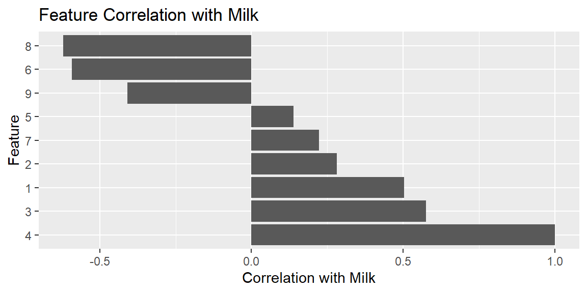
# Select features based on a correlation threshold, for example, features with absolute correlation > 0.3
relevant_features <- names(milk_correlations[which(abs(milk_correlations) > 0.3)])
print(relevant_features)
[1] "Red_Meat" "Eggs" "Milk" [4] "Cereal" "Nuts" "Fruits_Vegetables"While Filter Methods are an efficient way to reduce dimensionality, especially in the preliminary stages of model development, they should be part of a broader feature selection strategy that may include more sophisticated methods. Combining various methods thoughtfully can lead to the development of more accurate and robust predictive models.
-
Wrapper Methods: Wrapper methods select features based on the performance of a predictive model, where features are added or removed according to their contribution to model accuracy. This approach differs from filter methods, which rely on the general characteristics of the data, and embedded methods, which perform feature selection as part of the model training process.
Example: Applying Wrapper Methods to the Protein Dataset
Assuming we are interested in modeling Milk consumption based on the other dietary habits reflected in the dataset (like Red_Meat, White_Meat, Eggs, etc.), we could use a wrapper method to select the most relevant features for predicting Milk consumption. This process involves iteratively adding or removing features based on their impact on the model’s predictive accuracy.
We use a stepwise regression approach, which considers both addition and removal of features based on their statistical significance to the model’s performance. The
stepAICfunction from theMASSpackage in R can perform this operation, aiming to minimize the Akaike Information Criterion (AIC) for model selection:library(MASS) fit <- lm(Milk ~ ., data=Protein) stepModel <- stepAIC(fit, direction="both", trace = 1)Start: AIC=68.39 Milk ~ Comunist + Region + Red_Meat + White_Meat + Eggs + Fish + Cereal + Starch + Nuts + Fruits_Vegetables Df Sum of Sq RSS AIC - Fruits_Vegetables 1 2.125 149.69 66.743 - Red_Meat 1 2.736 150.31 66.845 - White_Meat 1 3.274 150.84 66.934 - Eggs 1 3.568 151.14 66.983 - Nuts 1 5.281 152.85 67.265 - Cereal 1 8.037 155.61 67.712 - Starch 1 9.911 157.48 68.011 <none> 147.57 68.386 - Fish 1 57.513 205.08 74.613 - Comunist 1 107.506 255.08 80.067 - Region 2 180.686 328.26 84.373 Step: AIC=66.74 Milk ~ Comunist + Region + Red_Meat + White_Meat + Eggs + Fish + Cereal + Starch + Nuts Df Sum of Sq RSS AIC - Red_Meat 1 1.861 151.56 65.052 - White_Meat 1 2.791 152.49 65.205 - Eggs 1 3.327 153.02 65.293 - Nuts 1 4.953 154.65 65.557 - Starch 1 8.849 158.54 66.179 - Cereal 1 11.784 161.48 66.637 <none> 149.69 66.743 + Fruits_Vegetables 1 2.125 147.57 68.386 - Fish 1 69.345 219.04 74.259 - Comunist 1 131.382 281.08 80.494 - Region 2 251.016 400.71 87.359 Step: AIC=65.05 Milk ~ Comunist + Region + White_Meat + Eggs + Fish + Cereal + Starch + Nuts Df Sum of Sq RSS AIC - Eggs 1 2.028 153.58 63.384 - Starch 1 7.037 158.59 64.187 - Nuts 1 8.774 160.33 64.459 - White_Meat 1 12.466 164.02 65.028 <none> 151.56 65.052 - Cereal 1 12.641 164.20 65.055 + Red_Meat 1 1.861 149.69 66.743 + Fruits_Vegetables 1 1.250 150.31 66.845 - Fish 1 67.778 219.33 72.293 - Comunist 1 148.324 299.88 80.113 - Region 2 249.667 401.22 85.391 Step: AIC=63.38 Milk ~ Comunist + Region + White_Meat + Fish + Cereal + Starch + Nuts Df Sum of Sq RSS AIC - Starch 1 5.327 158.91 62.237 - Nuts 1 9.676 163.26 62.912 <none> 153.58 63.384 - Cereal 1 14.196 167.78 63.594 - White_Meat 1 17.706 171.29 64.112 + Eggs 1 2.028 151.56 65.052 + Fruits_Vegetables 1 1.376 152.21 65.159 + Red_Meat 1 0.562 153.02 65.293 - Fish 1 69.467 223.05 70.713 - Comunist 1 193.735 347.32 81.784 - Region 2 249.861 403.44 83.529 Step: AIC=62.24 Milk ~ Comunist + Region + White_Meat + Fish + Cereal + Nuts Df Sum of Sq RSS AIC - Nuts 1 11.171 170.08 61.935 - Cereal 1 12.726 171.64 62.163 <none> 158.91 62.237 + Starch 1 5.327 153.58 63.384 - White_Meat 1 22.106 181.02 63.493 + Fruits_Vegetables 1 1.168 157.74 64.052 + Eggs 1 0.318 158.59 64.187 + Red_Meat 1 0.098 158.81 64.221 - Fish 1 75.734 234.65 69.980 - Comunist 1 192.708 351.62 80.092 - Region 2 247.305 406.22 81.700 Step: AIC=61.94 Milk ~ Comunist + Region + White_Meat + Fish + Cereal Df Sum of Sq RSS AIC - Cereal 1 7.49 177.57 61.012 - White_Meat 1 14.09 184.18 61.925 <none> 170.08 61.935 + Nuts 1 11.17 158.91 62.237 + Starch 1 6.82 163.26 62.912 + Eggs 1 0.57 169.51 63.851 + Fruits_Vegetables 1 0.34 169.74 63.885 + Red_Meat 1 0.34 169.74 63.885 - Fish 1 77.57 247.65 69.328 - Comunist 1 181.55 351.63 78.093 - Region 2 480.69 650.77 91.482 Step: AIC=61.01 Milk ~ Comunist + Region + White_Meat + Fish Df Sum of Sq RSS AIC <none> 177.57 61.012 - White_Meat 1 19.40 196.97 61.604 + Cereal 1 7.49 170.08 61.935 + Nuts 1 5.93 171.64 62.163 + Starch 1 5.07 172.50 62.288 + Fruits_Vegetables 1 2.15 175.42 62.708 + Eggs 1 1.29 176.28 62.830 + Red_Meat 1 0.31 177.26 62.969 - Fish 1 140.03 317.60 73.548 - Comunist 1 253.74 431.31 81.199 - Region 2 552.09 729.66 92.342summary(stepModel)Call: lm(formula = Milk ~ Comunist + Region + White_Meat + Fish, data = Protein) Residuals: Min 1Q Median 3Q Max -5.6316 -1.6205 0.0353 1.4023 5.7698 Coefficients: Estimate Std. Error t value Pr(>|t|) (Intercept) 37.4316 3.3803 11.074 9.94e-10 *** ComunistYes -8.1633 1.5667 -5.211 4.98e-05 *** RegionCenter -8.8917 2.1961 -4.049 0.000685 *** RegionSouth -17.3002 2.2512 -7.685 3.03e-07 *** White_Meat -0.3832 0.2660 -1.441 0.165963 Fish -0.9794 0.2530 -3.871 0.001029 ** --- Signif. codes: 0 '***' 0.001 '**' 0.01 '*' 0.05 '.' 0.1 ' ' 1 Residual standard error: 3.057 on 19 degrees of freedom Multiple R-squared: 0.8535, Adjusted R-squared: 0.8149 F-statistic: 22.13 on 5 and 19 DF, p-value: 2.555e-07This code starts with a model that includes all available features (except Milk, which is our target variable) and then iteratively adds or removes features to find a combination that offers the best balance between model complexity and predictive power, as measured by the AIC.
Evaluating the Selected Features
The output of
stepAICwill indicate which features have been selected as predictors for Milk consumption. These features are deemed by the stepwise regression process as having significant predictive power for Milk consumption, after considering the potential for overfitting (through AIC minimization).This approach allows for an automated and data-driven selection of features, which can be especially useful when dealing with datasets with many variables. By focusing on the subset of features that contribute most to prediction accuracy, wrapper methods can help create more efficient and interpretable models.
-
Embedded Methods: Embedded methods are particularly useful as they perform feature selection while the model is being trained, which can lead to a more optimal set of features for the prediction task at hand. Regularization methods like LASSO (Least Absolute Shrinkage and Selection Operator) are common examples of embedded methods because they both train the model and select features by penalizing the absolute size of the regression coefficients.
Embedded methods combine the qualities of filter and wrapper methods by performing feature selection as part of the model training process. This approach can lead to more accurate and efficient models because it considers the interaction between features and the model. One key advantage of embedded methods is their ability to capture complex interactions between features, which might be missed by filter methods.
Example: Protein Data
In this example, we’ll use the Protein data to predict Milk consumption using various dietary habits reflected in the dataset (like Red Meat, White Meat, Eggs, etc.). We’ll apply LASSO regression, an embedded method, using the
tidymodelsframework, which simplifies model training, feature selection, and prediction in R.library(tidyverse) library(MultBiplotR) library(tidymodels) data(Protein) # Protein <- Protein %>% mutate(Comunist = as.numeric(Comunist == "Yes"), # Region = as.numeric(factor(Region))) # Splitting the dataset set.seed(123) split <- initial_split(Protein, prop = 0.75) train_data <- training(split) test_data <- testing(split)We’ll use a LASSO regression model, which is suited for datasets with potentially correlated predictors and can help in feature selection by shrinking some coefficients to zero.
lasso_spec <- linear_reg(penalty = 0.1, mixture = 1)  |>
  set_engine("glmnet") |>
  set_mode("regression")

recipe <- recipe(Milk ~ ., data = train_data)  |>
  step_normalize(all_numeric_predictors()) |>
  step_dummy(all_nominal_predictors())

lasso_fit <- workflow() %>%
  add_model(lasso_spec) %>%
  add_recipe(recipe) %>%
  fit(data = train_data)

results <- lasso_fit %>%
  predict(new_data = test_data) %>%
  bind_cols(test_data) %>%
  metrics(truth = Milk, estimate = .pred)

selected_features <- lasso_fit %>%
  pull_workflow_fit() %>%
  tidy() %>%
  filter(estimate != 0) %>% # Selecting non-zero coefficients
  pull(term)

print(results)
# A tibble: 3 × 3 .metric .estimator .estimate <chr> <chr> <dbl> 1 rmse standard 5.88 2 rsq standard 0.563 3 mae standard 5.06print(selected_features)[1] "(Intercept)" "Red_Meat" "Eggs" [4] "Cereal" "Starch" "Nuts" [7] "Fruits_Vegetables" "Comunist_Yes" "Region_Center" [10] "Region_South"This process will provide us with an understanding of which dietary habits (features) are most predictive of Milk consumption, leveraging the embedded method’s ability to perform feature selection in conjunction with model training. By focusing on the subset of features that contribute most to prediction accuracy, we can create more efficient and interpretable models.
Feature Extraction
Feature extraction transforms the data in the high-dimensional space to a space of fewer dimensions. The data transformation may be linear or nonlinear, with the transformed features being combinations of the original features. The most common feature extraction techniques include:
-
Principal Component Analysis (PCA):
- Purpose: PCA reduces dimensionality by transforming the original variables into a new set of uncorrelated variables, called principal components, which are ordered by the amount of original variance they capture. The first principal component captures the most variance, the second captures the second most, and so on.
Suppose we had two variables: height and hair color (some measure of darkness of hair) for a Native American tribe. Below is a scatterplot of the two variables:

It’s evident that in this tribe, the variation in hair color among individuals is minimal compared to the range of their heights. Therefore, height emerges as a more significant characteristic than hair color. Consequently, by incorporating only the height of individuals from this tribe as a feature in the dataset, we can preserve the majority of the relevant information.
Most situation do not result in a scatterplot as we see above. Instead, you may see a situation as below.
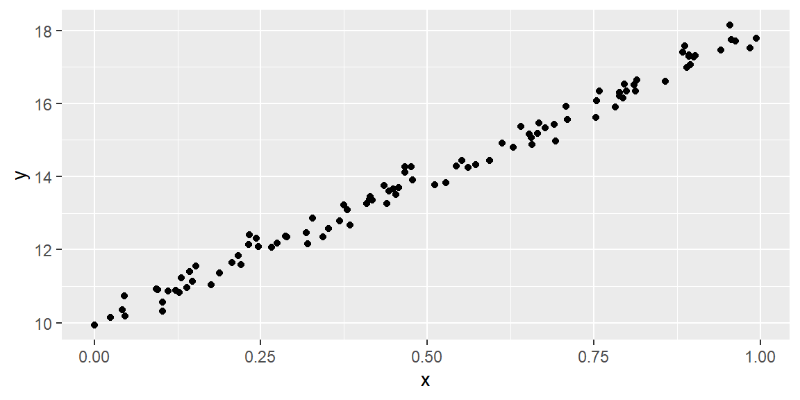
Instead of \(X\) or \(y\) having small variability, we can imagine a line drawn through the points and the variability of the points about that line is small.
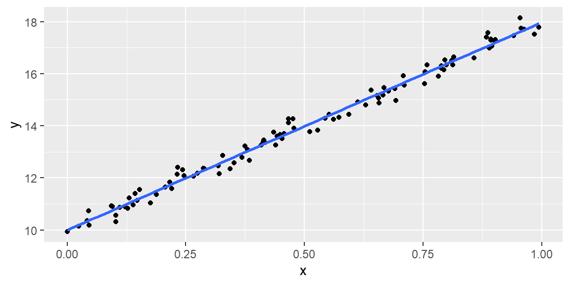
If we rotate the plot so that the blue line is now the horizontal axis, the new axes can then be examined and we can use ony the axis that has the larger variability. These new axes are called the Principal Components.
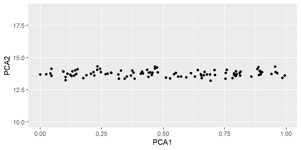
In this example, the first principal component (PCA1) has large variability. the second principal component (PCA2) has small variability. So if we use only PCA1 as our feature, then we only lose a small amount of information in how the data varies when we do not select PCA2.
- How it Works: PCA starts by calculating the covariance matrix of the data to understand how variables are related. It then computes the eigenvectors and eigenvalues of this covariance matrix. Eigenvectors determine the directions of the new space, and eigenvalues determine their magnitude. In essence, the eigenvectors with the highest eigenvalues are selected to form the new set of variables.
- Applications: PCA is widely used in exploratory data analysis and for making predictive models. It’s particularly useful in processing images, genomics data, and in areas where the data dimensions are very high.
-
Linear Discriminant Analysis (LDA):
- Purpose: LDA is a supervised dimensionality reduction technique used to find the linear combinations of features that best separate two or more classes of objects or events. The goal is to project the features in higher-dimensional space onto a lower-dimensional space with good class-separability in order to avoid overfitting (“curse of dimensionality”) and also reduce computational costs.
- How it Works: LDA computes the directions (“linear discriminants”) that will represent the axes that maximize the separation between multiple classes. It takes the mean and variance of each class into account and seeks to reduce variance within each class while maximizing variance between the classes.
- Applications: LDA is particularly useful in the preprocessing steps for pattern classification and machine learning applications. Its application spans across various fields including face recognition, medical diagnosis, and any domain requiring classification tasks.
-
t-Distributed Stochastic Neighbor Embedding (t-SNE):
- Purpose: t-SNE is a nonlinear technique for dimensionality reduction that is particularly well suited for the visualization of high-dimensional datasets. It converts similarities between data points to joint probabilities and tries to minimize the divergence between these joint probabilities in the high-dimensional and low-dimensional space.
- How it Works: t-SNE starts by calculating the probability that pairs of datapoints in the high-dimensional space are similar, then uses a gradient descent method to minimize the difference between this probability distribution and a similar distribution in the low-dimensional space.
- Applications: Because of its ability to preserve local structures and resolve clusters in a small area of the map, t-SNE is highly favored for visualizing high-dimensional data such as genetic data, image data, or text data.
Considerations When Choosing a Feature Extraction Technique:
- The nature of the dataset: Is it linear or nonlinear? PCA and LDA assume linear relationships between variables, while t-SNE does not.
- Supervised vs. Unsupervised learning: PCA and t-SNE are unsupervised methods (they do not require labeled data), whereas LDA is supervised (requires labeled data).
- Goal of dimensionality reduction: Is the goal to improve visualization (t-SNE), to prepare for a classification task (LDA), or to reduce feature space while retaining variance (PCA)?
- Computational resources and dataset size: PCA and LDA are relatively more computationally efficient than t-SNE, especially for very large datasets.
PCA Example: Protein Data
# Load necessary libraries
library(MultBiplotR)
library(tidyverse)
library(tidymodels)

# Load the Protein dataset
data("Protein")

# Prepare the data for PCA - select only numeric columns
protein_numeric <- Protein |>
  dplyr::select(where(is.numeric))

# PCA with tidymodels
pca_recipe <- recipe(~., data = protein_numeric) %>%
  step_normalize(all_predictors(), -all_outcomes()) %>%
  step_pca(all_predictors(), threshold = .75) #Get enough PCs to get 75% of variance

# Prep the recipe to estimate PCA components
dat_prep <- prep(pca_recipe, training = protein_numeric)

# Extract the PCA results
pca_results <- bake(dat_prep, protein_numeric)

# View the results
print(pca_results)
# A tibble: 25 × 3
PC1 PC2 PC3
<dbl> <dbl> <dbl>
1 3.49 -1.63 -1.76
2 -1.42 -1.04 1.34
3 -1.62 0.159 0.217
4 3.13 -1.30 0.151
5 -0.370 -0.603 1.20
6 -2.37 0.285 -0.752
7 -1.42 0.450 1.30
8 -1.56 -0.596 -2.05
9 -1.49 0.785 0.00188
10 2.24 1.00 -0.883
# ℹ 15 more rowstidy(dat_prep, number = 2, type = "variance") |>
filter(terms == "cumulative percent variance") |>
print()# A tibble: 9 × 4
terms value component id
<chr> <dbl> <int> <chr>
1 cumulative percent variance 44.5 1 pca_zPW5q
2 cumulative percent variance 62.7 2 pca_zPW5q
3 cumulative percent variance 75.2 3 pca_zPW5q
4 cumulative percent variance 85.8 4 pca_zPW5q
5 cumulative percent variance 91.0 5 pca_zPW5q
6 cumulative percent variance 94.6 6 pca_zPW5q
7 cumulative percent variance 97.6 7 pca_zPW5q
8 cumulative percent variance 98.9 8 pca_zPW5q
9 cumulative percent variance 100 9 pca_zPW5qWe see that only three principal components are needed to capture 75% of the variability present in the nine predictor variables.
# Visualize PCA results
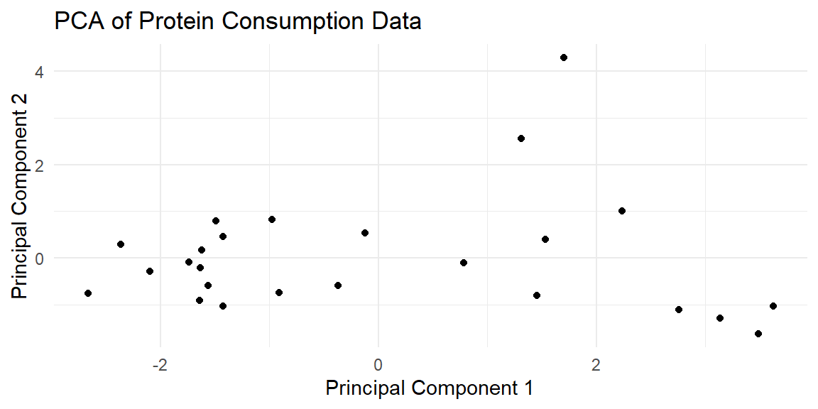
pca_results %>%
  ggplot(aes(x = PC1, y = PC2)) +
  geom_point() +
  theme_minimal() +
  ggtitle("PCA of Protein Consumption Data") +
  xlab("Principal Component 1") +
  ylab("Principal Component 2")