Module 3 was about comparing groups: does one channel outperform another, does one region differ from the rest? Those tools all ask a version of the same question, “is there a difference?” Starting this module, we shift to a different question: “how does one thing relate to another, and what can we predict from it?” This is the fifth step of the analytics decision cycle from Chapter 2, build a model, and regression is where we start.
Regression shows up constantly in business: how does advertising spend relate to sales? How does square footage relate to store revenue? How does an employee’s tenure relate to their performance rating? In every case, we have one variable we want to understand or predict (the response), and one or more variables we think help explain it (the predictor(s)). This section covers the simplest version, one predictor, one response, and a straight line connecting them.
21.2 Scatterplots: Seeing a Relationship
Before fitting anything, plot the data. A scatterplot puts the predictor (\(x\)) on the horizontal axis and the response (\(y\)) on the vertical axis, one point per observation. Three things to look for:
Direction: does \(y\) tend to increase as \(x\) increases (positive), decrease (negative), or show no clear pattern?
Form: does the pattern look roughly straight (linear), curved, or scattered with no discernible shape?
Strength: how tightly do the points cluster around that pattern, versus scattering widely around it?
ExampleExample 8.1: TV advertising and sales
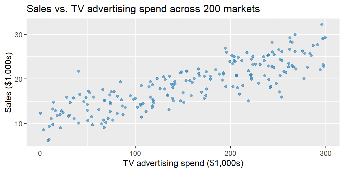
A company tracks 200 regional markets. In each market, it records tv, the amount spent on TV advertising last quarter (in $1,000s), and sales, product sales in that market over the same period (in $1,000s).
library(tidyverse)ads <-read_csv("data/advertising.csv")ggplot(ads, aes(x = tv, y = sales)) +geom_point(alpha =0.6, color ="#2c7fb8") +labs(title ="Sales vs. TV advertising spend across 200 markets",x ="TV advertising spend ($1,000s)", y ="Sales ($1,000s)")
The pattern is positive, roughly linear, and reasonably tight, markets that spend more on TV advertising tend to have higher sales, and the relationship looks close to a straight line.
21.3 The Correlation Coefficient
A scatterplot shows a relationship; the correlation coefficient\(r\) measures its strength and direction as a single number. For two variables \(x\) and \(y\) measured on \(n\) observations, \[
r = \frac{\sum (x_i - \bar{x})(y_i - \bar{y})}{\sqrt{\sum (x_i - \bar{x})^2 \sum (y_i - \bar{y})^2}}
\]\(r\) always falls between \(-1\) and \(1\). Its sign matches the direction of the relationship, and its magnitude reflects strength:
\(|r|\) range
Interpretation
0.0 to 0.3
Weak (or no) linear relationship
0.3 to 0.7
Moderate linear relationship
0.7 to 1.0
Strong linear relationship
exactly \(\pm 1\)
Perfect linear relationship (all points fall exactly on a line)
ImportantCorrelation measures linear association only
\(r\) can be close to 0 even when \(x\) and \(y\) are strongly related, if that relationship is curved rather than straight. Always look at the scatterplot; a summary number can hide a pattern a picture would immediately reveal. \(r\) is also sensitive to outliers, a single extreme point can pull it noticeably higher or lower than the bulk of the data would suggest.
ExampleExample 8.2: Computing the correlation
Continuing Example 8.1:
cor(ads$tv, ads$sales)
[1] 0.8448615
\(r \approx 0.845\): a strong, positive linear relationship between TV advertising spend and sales.
21.4 The Least-Squares Line
A correlation summarizes the relationship’s strength, but it doesn’t give us a way to predict \(y\) from a specific value of \(x\). For that, we fit a line, \[
\hat{y} = b_0 + b_1 x
\] where \(\hat{y}\) (read “y-hat”) is the line’s predicted value of \(y\) for a given \(x\), \(b_1\) is the slope, and \(b_0\) is the intercept. For any observation, the residual is the gap between what actually happened and what the line predicted, \(e_i = y_i - \hat{y}_i\).
Many lines could be drawn through a scatterplot. The least-squares line is the one specific line that minimizes the sum of squared residuals, \(\sum e_i^2\), across all observations. Squaring keeps positive and negative residuals from canceling out and penalizes large misses more than small ones. This single criterion has a clean closed-form solution: the slope and intercept that minimize \(\sum e_i^2\) are \[
b_1 = r\,\frac{s_y}{s_x} \qquad\qquad b_0 = \bar{y} - b_1 \bar{x}
\] where \(s_x\) and \(s_y\) are the sample standard deviations of \(x\) and \(y\). Notice that \(r\) and \(b_1\) always share the same sign, but they’re not the same thing: \(r\) is a unitless measure of strength, while \(b_1\) carries the units of \(y\) per unit of \(x\) and depends on how spread out \(x\) and \(y\) happen to be.
ExampleExample 8.3: Fitting the line by hand, then checking it
From Example 8.1’s data: \(n = 200\), \(\bar{x} = 156.12\), \(s_x = 85.17\), \(\bar{y} = 18.73\), \(s_y = 5.31\), and \(r = 0.845\) (from Example 8.2). By the formulas above: \[
b_1 = 0.845 \times \frac{5.31}{85.17} \approx 0.0527
\]\[
b_0 = 18.73 - (0.0527)(156.12) \approx 10.50
\] So the fitted line is \[
\widehat{\text{sales}} = 10.50 + 0.0527\,(\text{tv})
\] Fitting the same model in R confirms this by-hand result:
model <-lm(sales ~ tv, data = ads)summary(model)
Call:
lm(formula = sales ~ tv, data = ads)

Residuals:
   Min     1Q Median     3Q    Max
-7.937 -2.266  0.288  2.244  9.027

Coefficients:
             Estimate Std. Error t value Pr(>|t|)
(Intercept) 10.504046   0.421609   24.91   <2e-16 ***
tv           0.052711   0.002372   22.22   <2e-16 ***
---
Signif. codes:  0 '***' 0.001 '**' 0.01 '*' 0.05 '.' 0.1 ' ' 1

Residual standard error: 2.85 on 198 degrees of freedom
Multiple R-squared:  0.7138,    Adjusted R-squared:  0.7123
F-statistic: 493.8 on 1 and 198 DF,  p-value: < 2.2e-16
The (Intercept) and tv estimates, 10.504 and 0.0527, match the hand calculation. (Later this chapter and Chapter 22 return to the rest of this output, the standard errors, t-values, and R-squared.)
21.5 Interpreting the Slope and Intercept
The slope and intercept only mean something once translated back into the business context:
Slope (\(b_1 \approx 0.0527\)): for every additional $1,000 spent on TV advertising, predicted sales increase by about $52.70, holding nothing else fixed, since this is the only predictor in the model so far.
Intercept (\(b_0 \approx 10.50\)): predicted sales when TV spending is $0 is about $10,500. Here that’s a meaningful baseline (sales from other channels, word of mouth, existing customers) since $0 falls within the observed range of tv (the data ranges from about $0.81k to $299k). In general, be cautious interpreting an intercept at \(x=0\) if zero falls far outside the data you actually observed.
21.6 Making a Prediction
Once fitted, the line can predict \(\hat y\) for any value of \(x\) within (or close to) the range of the observed data.
ExampleExample 8.4: Predicting sales at a given ad spend
What sales would the model predict for a market spending $200,000 on TV advertising (\(x=200\))? \[
\hat{y} = 10.50 + 0.0527(200) \approx 21.04
\] Predicted sales of about $21,040. In R:
predict(model, newdata =data.frame(tv =200))
       1
21.04634
NoteDon’t extrapolate far beyond your data
The observed tv values in this dataset run from about $0.81k to $299.47k. The fitted line describes the relationship within that range; predicting sales at, say, $2,000,000 of TV spend assumes the same straight-line relationship continues to hold far outside anything actually observed, an assumption the data simply can’t support.
21.7 Computing Correlation and Regression in R and Excel
ExampleExample 8.5: The advertising example in R and Excel
In R, cor() gives the correlation and lm() fits the least-squares line, both shown above. To pull out just the coefficients:
coef(model)
(Intercept)          tv
10.50404599  0.05271145
In Excel, CORREL(y_range, x_range) gives \(r\), and SLOPE(y_range, x_range) and INTERCEPT(y_range, x_range) give \(b_1\) and \(b_0\) directly:
Alternatively, the Data Analysis ToolPak’s Regression tool produces a full output table (coefficients, standard errors, R-squared) in one step, similar to R’s summary(model), and a scatter chart’s Add Trendline option (with “Display Equation on chart” checked) overlays the least-squares line directly on the plot.
21.8 Recap
Keyword
Definition
Scatterplot
A plot of paired \((x,y)\) observations, used to visually assess direction, form, and strength of a relationship.
Correlation coefficient (\(r\))
A number between \(-1\) and \(1\) measuring the strength and direction of the linear relationship between two variables.
Least-squares line
The line \(\hat{y}=b_0+b_1x\) that minimizes the sum of squared residuals, \(\sum(y_i-\hat{y}_i)^2\).
Slope (\(b_1\))
\(r(s_y/s_x)\); the predicted change in \(y\) for a one-unit increase in \(x\).
Intercept (\(b_0\))
\(\bar{y}-b_1\bar{x}\); the predicted value of \(y\) when \(x=0\).
Residual
\(e_i = y_i - \hat{y}_i\), the gap between an observed value and the line’s prediction for it.
Extrapolation
Predicting \(\hat y\) for an \(x\) far outside the range of the observed data; unreliable since the line’s behavior there was never actually observed.
21.9 Check Your Understanding
NoteProblems
A scatterplot of employee tenure (years) against annual sales ($) shows points that slope upward and cluster tightly around a straight line. In your own words, describe what this pattern implies about direction, form, and strength.
A dataset has \(\bar{x}=40\), \(s_x=8\), \(\bar{y}=120\), \(s_y=15\), and \(r=0.6\). Compute the least-squares slope and intercept.
Using your answer to Problem 2, write the fitted line’s equation and predict \(\hat{y}\) when \(x=50\).
A retailer finds \(r=-0.72\) between a store’s average discount rate and its profit margin. Interpret this correlation in plain business language, direction, strength, and what it does (and doesn’t) tell you about causation.
Suppose the TV advertising model from this section (\(\hat{y}=10.50+0.0527x\)) is used to predict sales at \(x=5{,}000\) (that is, $5,000,000 of TV spending). Explain why this prediction should not be trusted, even though the arithmetic is straightforward.
Two analysts fit the same data. Analyst A reports \(r=0.85\). Analyst B reports a slope of \(b_1=12.3\). Explain why both can be correct at the same time, and what each number tells you that the other doesn’t.
TipSolutions
Direction: positive, tenure and sales increase together. Form: linear, the pattern is described as following a straight line. Strength: strong, the tight clustering around the line indicates a strong linear relationship (a correlation coefficient close to \(\pm 1\)).
The relationship is moderately-to-strongly negative and fairly strong (\(|r|=0.72\)): stores with higher average discount rates tend to have lower profit margins, and vice versa. This correlation alone does not establish that discounting causes lower margins; a confounder (for example, stores in more price-competitive markets might both discount more heavily and face margin pressure for unrelated reasons) could produce the same pattern, a point this course returns to in Chapter 19.
\(x=5{,}000\) falls far outside the range of TV spending actually observed in the data (roughly $0.81k to $299k). The fitted line only describes the relationship within that observed range; extrapolating this far beyond it assumes the same straight-line pattern continues indefinitely, an assumption nothing in the data can support, and the resulting prediction (over $273,000 in sales) should not be trusted.
\(r\) and \(b_1\) describe different things and are not interchangeable. \(r=0.85\) says the linear relationship is strong and positive, but says nothing about units or scale. \(b_1=12.3\) says that for each one-unit increase in \(x\), \(y\) is predicted to increase by 12.3 units, a statement that depends entirely on how \(x\) and \(y\) happen to be measured (e.g., dollars versus thousands of dollars would change \(b_1\) but not \(r\)). Both can be true simultaneously because they’re computed from the same data but answer different questions, strength/direction versus a specific, unit-dependent rate of change.